| February 5, 2011 4:00 PM. Is Your Website Ready For the Coming Tablet Explosion? By John Paul Titlow R | ||
| With Yola's professional templates and easy-to-use tools, you can make a website that helps you stand out from the competition. | ||
| ||
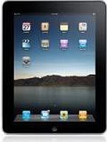
| Test Your Site on a Tablet Using your own site on a tablet computer is the only way to get an accurate idea of what other users experience when they browse your site from such a device. The iPad runs a modified version of Safari, so if your Website works in that browser on desktops, it's probably fine on the iPad, but there's no guarantee. Weird issues with the layout may crop up out of nowhere. A JavaScript file could misfire. Don't own an iPad or another tablet computer yet? Borrow one. Walk down to the Apple Store if you have to. At the very least, check to make sure your site's design and functionality are intact. If you're desperate, you could even download Apple's iOS SDK, which comes with a desktop iPad simulator. There are a few Web-based simulators, but these are not reliable, because they are still using your desktop browser's engine to render the site. Simplify the Layout Even if your desktop site's design renders properly on tablets, that doesn't mean the battle is won. If simplicity is important in standard Web design, it's even more critical in designing for the iPad and similar devices. As a rule of thumb, strip out any elements of a page's layout that are not absolutely essential. Consider dropping that three-column layout for two columns. In many cases, cleaning up your site's design for the benefit of tablet browsers will have the added advantage of making the desktop browsing experience better. Keep in mind some of the unique features of the tablet form factor. Users swipe and touch rather than scrolling and clicking. They can turn the device on its side and the browser will flip accordingly. You can use CSS media query declarations to adapt your site's design depending on the device's orientation. You could develop a different design entirely for tablet users or simply make your site's user experience one that meets desktops and tablets halfway. Ditch the Flash This one almost goes without saying, but if you haven't rethought that Flash-based navigation menu or site introduction, now is the time to scrap it. Apple has made clear its stance on Flash, which will probably never be support by iOS. While Android does support Flash, so far the experience of trying to load Flash content on Android devices has not been impressive. No matter where you stand on the mobile Flash debate, it's hard to deny that more open standards like HTML5 and JavaScript can accomplish most of what Flash does. And while the Flash experience on Android may improve over time, Apple's iPad is overwhelmingly dominant in this space for the time being, so we have to play by their rules, to some extent. Check Your Form Fields One aspect of a desktop site that's worth keeping a close eye on is its Web forms. Whether they're used for a simple contact form, newsletter sign-up or an e-commerce shopping cart, forms are an important part of the user experience, especially for business sites. Broken or poorly formatted form fields can lead to frustration for users, who will abandon that sign-up form or shopping cart without a second thought. To see what the experience is like, try filling out the forms on your site from at least one tablet, preferably an iPad since that's what most people are using at this point. Do the fields render clearly? Is the process tedious? If there any form fields that are not absolutely necessary, get rid of them. For formatting issues, use CSS to tweak the appearance of form fields. If it becomes necessary, you may want to consider looking at a third party form builder like Wufoo, which also makes customizing the design of Web forms a breeze. Make the User Interface App-Like One of the icons I tap most frequently on my iPad's home screen is not for a native application at all, but rather the mobile Web version of Gmail, which looks and feels a lot like an iOS app. Google has done an especially good job of adapting their existing Web services to the mobile and tablet form factors, and they do so using HTML5 and JavaScript. If your technical resources and budget allow for it, consider building a tablet-specific version of your site that utilizes some of the more app-like interface elements like subtle animations and a navigation that responds to finger-swiping. This kind of Web app can be the most enjoyable to use, and your users will appreciate it. | ||
lunes, 7 de febrero de 2011
Is Your Website Ready For the Coming Tablet Explosion?
domingo, 6 de febrero de 2011
Interlat: Guia para realizar un plan de negocios en Internet- Luis Carlos Chaquea
Mobile Phones Transform Kenyan Publishers
Suscribirse a:
Comentarios (Atom)

